Note
Click here to download the full example code
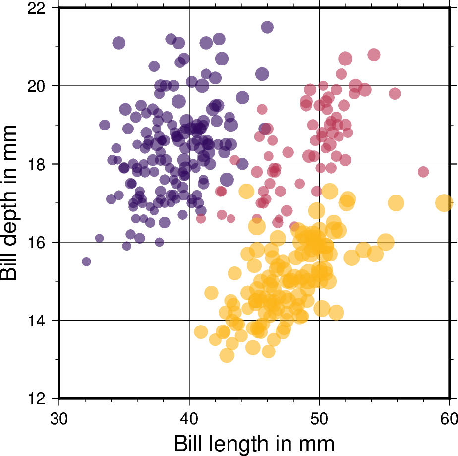
Color points by categories
The pygmt.Figure.plot method can be used to plot symbols which are
color-coded by categories.

Out:
<IPython.core.display.Image object>
import numpy as np
import pandas as pd
import pygmt

# Load sample penguins data and convert 'species' column to categorical dtype
df = pd.read_csv("https://github.com/mwaskom/seaborn-data/raw/master/penguins.csv")
df["species"] = df.species.astype(dtype="category")

# Use pygmt.info to get region bounds (xmin, xmax, ymin, ymax)
# The below example will return a numpy array like [2.  4.4 4.3 7.9]
region = pygmt.info(
    table=df[["bill_length_mm", "bill_depth_mm"]],  # x and y columns
    per_column=True,  # report output as a numpy array
    spacing="3/2",  # rounds x and y intervals by 3 and 2 respectively
)

# Make our 2D categorical scatter plot, coloring each of the 3 species differently
fig = pygmt.Figure()

# Generate basemap of 10cm x 10cm size
fig.basemap(
    region=region,
    projection="X10c/10c",
    frame=['xafg+l"Bill length in mm"', 'yafg+l"Bill depth in mm"', "WSen"],
)

# Define colormap to use for three categories
pygmt.makecpt(cmap="inferno", color_model="+c", series=(0, 3, 1))

fig.plot(
    # Use one feature as x data input (bill length)
    x=df.bill_length_mm,
    # Use another feature as y data input (bill depth)
    y=df.bill_depth_mm,
    # Vary each symbol size according to another feature (body mass)
    sizes=7.5 * 10 ** -5 * df.body_mass_g,
    # Points colored by categorical number code
    color=df.species.cat.codes.astype(int),
    # Use colormap created by makecpt
    cmap=True,
    # Do not clip symbols that fall close to the map bounds
    no_clip=True,
    # Use circles as symbols with size in centimeter units
    style="cc",
    # Set transparency level for all symbols to deal with overplotting
    transparency=40,
)

# A colorbar displaying the individual categories will be added after the
# upcoming GMT 6.2.0. version was released.

fig.show()
Total running time of the script: ( 0 minutes 1.852 seconds)